Services
02 of 04
Visual identity
A look nobody could mistake for anyone else.
Logo, type, colour and the system that holds them together, built to work as well on a billboard as in a product.
Start a project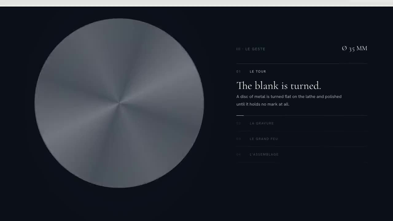
Why it matters
If people can’t recognise you, they can’t remember you.
Most companies look like their competitors: the same safe blue, the same stock photography, a logo that could belong to anyone. It feels like playing it safe, but it makes every euro of marketing work harder, because nobody remembers who it came from.
A strong visual identity does the opposite. It makes you recognisable from a distance and consistent up close, on a building, a website or a business card.
What you get
- 01
Logo & mark
A logo and mark built on the strategy, designed to work as large as a building and as small as a browser tab.
- 02
Typography & colour
A type and colour system with character, chosen for how it reads on screen as much as in print.
- 03
Brand guidelines
Clear rules and real examples, so your team and future partners can use the identity without watering it down.
- 04
Templates
Ready-made templates for the things you make every week, from presentations to social posts, so the brand holds up long after hand-over.
How we work
How we approachvisual identity.
Every visual identity project runs through the same four steps, as part of one process from the first workshop to launch.
-
01
Direction
Starting from the strategy, we explore a few clearly different routes and choose one together.
-
02
Design
The chosen route grows into a full system: mark, type, colour, imagery and motion.
-
03
Test
We put the identity to work on real applications, from the website to signage, and refine what doesn’t hold up.
-
04
Roll out
Guidelines, templates and files for every format, and support while the first things go live.
Selected work
Visual identity in practice.
-
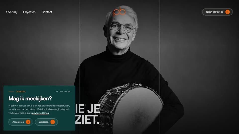
Peter Bottema Techniek
Fifty years of sound and light, finally online the way it sounds.
- Brand refresh
- Website with project archive
- Service pages
-
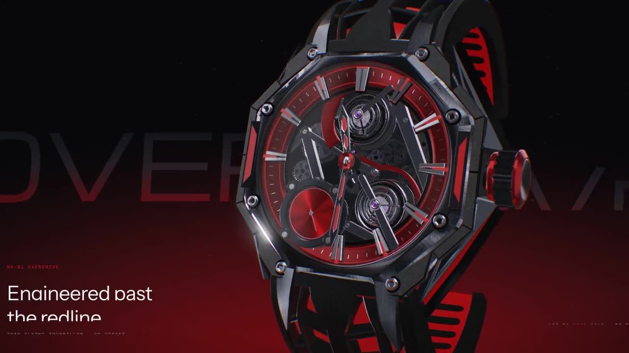
NOXARC
A twin-tourbillon watch, launched like a supercar.
- Real-time 3D watch
- Exploded anatomy
- Scroll-driven launch
-
Aurèle Vauclair
A century and a half of hand engraving, told by light.
- 3D dial that catches the light
- Guilloché drawn ray by ray
- Appointment flow
Questions
How many logo options do we get?
We show a few clearly different directions, each with its reasoning, rather than dozens of variations. Choosing between ideas is easier than choosing between details.
Can you refresh our identity instead of replacing it?
Yes. When a brand has recognition worth keeping, we evolve it: keep what people know, and fix what holds it back. Our work for Peter Bottema Techniek is an example.
Do we get all the files?
Yes. You receive the full identity in every format you need, for print and for screen, along with the guidelines and templates.
Does the identity include motion?
It can. Brands increasingly live on screens, so we often define how the identity moves as well, together with our motion & 3D specialists.
Other services